Monthly Archives: September 2015

Kaizena: Integrating Effective Writing Instruction Strategies

Developing effective written communication is an essential skill that we hone at Morningside College. Doing this requires work on both the part of the student and the instructor. Writing is a process that requires several steps even to just begin writing, and then when the writing is happening, several drafts are required. The importance of feedback is essential and there are good and bad ways of giving and managing feedback to students. In this post, I want to describe a free product – Kaizena – that integrates several best practices of writing development. Tone of feedback, access to relevant instruction, evaluation of progress, and identification of necessary skills are all vital to helping students develop their writing.


Some ways that we as instructors can help facilitate are by utilizing voice comments over written comments. This allows us to communicate tone of voice with comments that is often lost with written feedback. We also try to link specific instances of student writing errors to lessons. Finally, it is often helpful for students to receive a sense of their progress on specific skills as they go through the drafting process. Many of us try to do all of this, but it can be extremely time consuming to do so. Kaizena is a program developed to integrate all of these features of writing instruction into one easy system.


Kaizena works with Google Drive and allows instructors to give four different types of feedback to student work: voice feedback, written feedback, lessons, and skills. Voice and written feedback are pretty self explanatory and Kaizena makes creating both of these very easy. Lessons allow the instructor to link either written, voice, or linked lessons (like instructional videos) to specific areas of the student writing. Skills provide a rating system to specific skills demonstrated in the student writing.


Of course none of these approaches to writing instruction are new, but what Kaizena does is seamlessly integrate all of these important pedagogies into one easy to use system for both instructor and student. Feedback given by the instructor is given in real time to the student electronically so Kaizena can even be used during face-to-face or virtual writing conferences as a way to record the feedback given.


The other feature that Kaizena provides is a running ‘conversation’ between the student and instructor for the entire term. All feedback elements, student replies to all assignments are presented in a linear fashion allowing the student and instructor to see the progress made in the development of writing skill.


The link to the Kaizena Website is here: https://kaizena.com/

Here is a nice overview video of how Kaizena works:

https://www.youtube.com/watch?t=38&v=ICtVnCtBwR4

The Evolution of E-Books

With computers and other electronic devices (phones, tablets, etc.) becoming more ubiquitous on college campuses, the presence of e-books has become more and more visible. E-books have been touted as a potential cost saving measure for students and publishers. Without the need to create physical books, the savings on materials should be passed along to the user, and the information is the same so the experience should be similar, right? This belief is not entirely true and there are benefits and drawbacks to using e-books.

Benefits:

  • Fewer heavy books to carry around daily
  • Easy searching using the e-book’s search function
  • Ability to highlight and write notes
  • Costs may be lower
  • Ability to include multimedia within the book

Drawbacks:

  • Comfort level using electronic books or simply a preference for physical books
  • E-book may be on a limited license use (i.e. 6 month access)
  • Loss of access because of limited Internet access or computer problems
  • Reading on a screen is different and potentially more difficult than reading from page

Some instructors have conducted casual polls in their courses and have found that students still tend to prefer a physical text book to an e-book and other published work has supported these classroom polls (e.g. Woody, Daniel, & Baker, 2009).

With the results of these polls and the drawbacks listed above, is there any benefit to having your students use an e-book in class? The answer to this, I believe lies in how e-books have evolved over the years.

What exactly is an e-book? What do you envision when you hear this term? Do you think of the novel that you are currently reading on your Kindle? Is it the PDF version of the textbook that the publisher makes available? If so, this is – in my opinion – the worst form that an e-book can take and in my mind has little benefit other than making ones backpack a little lighter. This is the first iteration of the e-book. Publishers have simply taken the text already created by the authors and put it into some reader form (Kindle, PDF, etc). It is nothing more than static text you read on the screen rather than the page.

However, if you can imagine a “book” that is more interactive and dynamic. A “book” that takes advantage of the medium by which it is delivered, then I believe there is potential greatness in e-books. But before I go into this detail, I first want to acknowledge that I have a bit of a biased view because I did assist in the creation of one of these books recently. Though there may be a little conflict of interest here (though I do not get any royalties from this book), I hope that you know that my interest in this area was present before I took on that project.

With tablets becoming more popular and mobile learning becoming more prevalent, the future of the e-book, I think, is bright – as long as they are created with the principles of how people learn best. Today’s e-books are less like “books” and more like interactive learning modules. The example I will discuss in this post is the platform being used by a well-known publisher in the textbook world.

First, the authoring system can be different for these books. Authors that start with the creation of the interactive elements (the things you want the students to do) and then go on to create the text to support that student’s ability to learn how to do this task is a newer approach to authoring. However, this is not a new approach to lesson and curriculum planning. This form of backward engineering focuses more on what we want the learner to accomplish or do, rather than on what the instructor or author tells (a focus on student learning, not on the teacher).

Second, these books take advantage of the multimedia capabilities of electronic devices. Information can be segmented into smaller pieces (rather than large blocks of text) and supported by things like video, online articles, quizzes, simulations, journal entry, discussion boards, demonstrations, and others). This supports the notion of repetition and multiple ways of processing information.

Third, these books have the potential of increasing student accountability. If the book is Internet based, then there is the ability to record student activity while progressing through the book. This could even be evaluated and graded. Particular activities could be assigned to be completed by a certain time and date. Of course there is the question of WHO is doing the work or students working together, but there can be ways of addressing these concerns.

Finally, there is a possibility of students having more positive experiences with these types of books. Breaking up material, including interesting and applied multimedia, including low-stakes concept checks can help to increase student motivation and attitude potentially. I am particularly interested to see if this is actually true. My sense is that the generally negative attitude toward e-books that research has shown in the past is due to the rather primitive nature of those books. Designing a better e-book that uses the science of learning, I would hope, would increase positive attitudes.

If you are interested in what these new-generation e-books might look like, you can check out the Revel products from Pearson (http://www.pearsonhighered.com/revel/). I am sure the other publishers have other products similar to this. This was the publisher I worked with. I was the content matter expert who created all of the interactive features of one of their Revel versions of a General Psychology book.

In Spring 2016 I plan on using one of these books in my General Psychology class and I will be sure to report my experiences using this book as well as asking my students about their experiences with a product like this.
New Moodle Look Coming

With the recent upgrades to Moodle will be coming a new look as well.  Previously, Morningside used a default theme called “Formal White.” We have learned that this theme does not play well with the new upgrade to Moodle.   Because of this we will be changing the default theme to “More.” This will result in your Moodle pages looking a bit different and possibly some of your blocks shifting position. We have decided to do this because there are a few important benefits that come with this change.

One benefit is in the grade book. With “More” the student names on the grade book do not scroll off the screen when scrolling right to left, similar to locking a column in excel or google sheet. Additionally, there have been issues with students not able to post to forums with the old Formal White theme.  This is resolved by changing the theme to “More.”

Sometime today (Monday, Sept 14) this change will happen so please be aware of this. If you do not use the default theme, your page should stay as is. This should only affect those that keep their Moodle pages on the default theme.

If you would like to try to play around and change your page theme, you can do so by going into the “edit settings” for the main page of your class and scrolling down to “appearance.” Here you can select a theme in the “Force Theme” menu. Obviously from the content of this post, some theme are better than others.  The folks at eclass4learning suggest either “More” (our new default theme) or “Clean.”

Here is a link to a PDF put together by Sherry Swan describing how theses themes compare on the computer and on a mobile device. Moodle Theme Comparison 20150910

Sherry describes the differences like this:

I have attached some screenshots of my Moodle sandbox course showing the Formal White (FW) theme, which is our current default, the Clean (C) theme, and the More (M) theme.
Page 1 shows PC screenshots of the three themes: FW, C, & M
Page 2 shows M with blocks either docked or moved to left side
Page 3 shows Android phone screenshots of FW and M
From the user’s perspective, when viewed on a PC, the differences are:
  • FW has darker shading around header and blocks, C and M have light shading that may not even be visible, depending on the clarity of one’s screen (you will notice that the shading is so light that my screenshots did not pick it up)
  • Color scheme differences in block text and descriptive labels, FW all block and descriptive text in black, C black and blue text, M black and orange text
  • Left and/or right blocks take up more space horizontally in C and M, so it is suggested that blocks be docked or placed all on one side or the other to leave more room for the main content area

From the user’s perspective, when viewed on an Android phone:

  • FW appears much the same as on PC, but much smaller
  • Color scheme differences as noted above
  • C and M show the main content area (the middle portion of FW view) first and then non-docked blocks appear at the bottom

My thanks to both Sherry Swan and Shaun Meyer for helping with this transition and providing the information included in this blog post.


Pi – A different venue for electronic communication with students

Earlier this summer I was contacted by a gentleman of a new Internet company that is developing a new communication application for the classroom (online or traditional). The product is called Pi (https://piapp.co/) and it basically uses a Twitter/Facebook-type interface and brings it into a course LMS (instructor just links to the Pi course page from the LMS).

The creators of this application voice their frustration with the traditional communication methods used in learning management systems (i.e. e-mail and forums) finding them to be less engaging with students not really interacting with one another as much as they could. So they set out to create an improved method.

The major differences as I see it are two-fold. 1) the interface is more like a social media platform that many students are very familiar with and 2) there are functions that push students to be more actively involved in discussions within this interface.

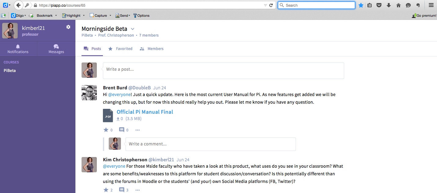
This is what the computer version of Pi looks like:

Pi Screenshot

As you can see it looks a little like a twitter feed, but has more of the posting ability of Facebook (not limited to 140 characters). This is a familiar interface for students, more so than some forum interfaces.

There are also mobile versions of this for both iOS and Android (not sure about Windows). Students can have the option of having push notifications active for Pi on their phones, which means, when there is a new post or reply they get an alert. Rather than depending on students going to visit a forum site to see if there are new posts or replies, now their device can alert them immediately. There is also the option of subscribing to e-mail alerts which again directs users to the conversations.

If you are interested in learning more about Pi, feel free to contact Brent Burd for a free account (Brent@piapp.co). Just let him know you are an instructor at Morningside College and are interested in testing out the product.

If you want to join my test class in Pi you can use this link (http://piapp.co/join/c439c) to join up and become a member of this ‘course.’ We can use this as something of a sandbox to play around with if you please.

For more information here are the online sites for Pi:

Website: https://piapp.co/

Twitter: https://twitter.com/piappHQ

Facebook: https://www.facebook.com/piapphq?fref=nf