Here’s a fun fact for you, one of the best way to counter the summer heat is with a cold beer and barbecue. Shocking right? Well, today had a high temperature over 100 degrees, so it was a perfect time for an expedition to The House of Q, a rather popular Sioux City barbecue restaurant. Having never been to the restaurant before, all I hoped for was a decent rack of ribs and an air-conditioned building. My expectations were obviously set much too low for The House of Q because they knocked it right out of the park.
Although I had never been to the restaurant itself, I have had a pulled pork sandwich from The House of Q catering service before. Thinking back on that pulled pork; I could remember how tender the meat was. The barbecue sauce was nearly perfect in my opinion, it had a little bit of a tangy taste to it, but not overpowering that it greatly affected the flavor of the meat. There wasn’t enough of the smoky barbecue flavor to the meat though, but that didn’t greatly diminish the sandwich. With this in mind, I was looking forward to seeing what all they had on their menu.
As a graphic designer, I notice things that others probably wouldn’t. Anytime I go to a restaurant, I tend to critique their branding and identity, menus, ads, and anything else that represents the restaurant. Most of the time I keep my thoughts to myself, but I have been known to share my thoughts with whoever is closest, and whether they understand what I’m talking about is beyond the point.
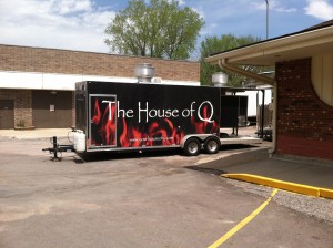
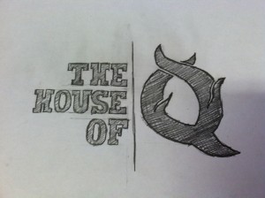
So, upon arriving at The House of Q, I first noticed their vans and vehicles, all with their branding clearly visible on the side of the vehicles. I let out a small groan and cringed a little when I saw their logo design. The use of Papyrus font is a collective no-no in the design world. It tends to be over used and doesn’t translate well to various formats, particularly when you use it on the web or on promotional items, both of which were issues for The House of Q. Now, I’m assuming they were using a font very similar to Papyrus because of it’s worn and distressed appearance, but there are better ways to go about that. The use of flames isn’t a bad choice, but personally, I was not a huge fan of the flames in the logo. Despite this, I was impressed with how consistently they used their branding and how easily definable their promotional and vehicles were with that same appearance.
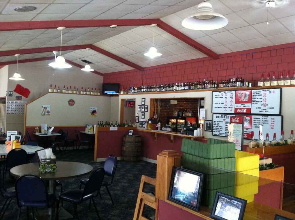
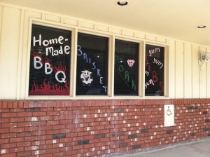
Stepping inside the restaurant, I was impressed by how open and large it was. The outside of the building did not do it justice for the size inside. I expected a large number of tables and not much room to move around, but instead it was a comfortable and relaxed environment. One of the first things just about everyone noticed right away was the beer bottles that lined the ordering counter. I could only assume they had a huge beer list and was interested in seeing what all they had. As it turns out, there was a front and back page of beer choices, most of which I had not heard of, and some of which I couldn’t even pronounce.
After browsing the beer list, I looked at the regular menu. I had mixed reactions to the menus that they were black and white sheets of paper stuffed with all the different options. I was impressed by how large and full the list was, and that for many of their items they conveniently described what the meal was. Unfortunately, the menu was almost too stuffed with information that it made it a little difficult to navigate. Some of the typography and layout was not as clean as it could have been, which added to the readability issues. Definitely not the worst menu I’ve laid my eyes on before, but not the best either.
House of Q Menu | House of Q Beer and Wine List
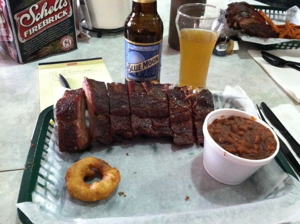
Enough of that, let’s get to the food. I ordered a ½ rack of pork ribs and smoked baked beans. To drink I stuck to one of my favorites, a Blue Moon. Instead of ordering at the table, we were to go up to the food counter and order there. It was a quick and painless process with the staff being helpful and friendly. In fact, it was the owner himself who took our order. The food was brought out very quickly, especially for our large group of 20. The aromas of the various barbecue and food swirled the room as the waitress delivered our food, only making those who had yet to receive it hungrier. The food, including mine, was served in plastic baskets and the silverware was all plastic, lending to the “finger-food” idea. The ribs were cooked with a dry rub and were given 4 options for barbecue sauce to add: original, honey, chipotle, and spicy. I remembered the original sauce from my previous experience with the pulled pork sandwich and chose that. The meat was tender and moist and cooked to perfection. Like the pulled pork sandwich, I didn’t get enough of a smoky taste in the meat like I would choose, but again, it didn’t greatly affect the overall flavor. The barbecue sauce enhanced the flavor allowing for a really enjoyable meal. After going through my first rib like it was nothing, I remembered I still had yet to try the beans. They were delicious and full flavored. They were of the right consistency, with the sauce being not too runny and not to pasty. They were the perfect side for the ribs in my opinion. The size and proportion was appropriate for the amount I ordered and the price of the meal, which in total was around $12 with the side.
The environment of the restaurant was inviting and comfortable. It was very family friendly, particularly with their “finger-food” options. It’s also a good place to go when you’re looking for a good meal and not looking to break the bank. And if you’re the competitive eater type, they had something for you too with their Q-Zilla Challenge. You could really get a feel for the owner’s personality in the restaurant, based off the décor and 60’s music playing in the background. All in all it was good experience, and the food definitely made it worth it. The only thing I saw that could use some improvement was in their branding and visual identity. I suggest the House of Q to anyone in the Siouxland area looking for some good and legitimate barbecue. Fellow designers, try to ignore the Papyrus and just enjoy the food!
[…] http://wordpress.morningside.edu/eatingoutwithadesigner/the-house-of-q-and-a-rant-about-papyrus/ […]