A well-established brand can do a lot of things for your restaurant, it can help explain to people who you are and what you do, as well as establish a form of communication before a customer even steps in the door. An identity goes beyond just a logo, too. It is shown through your restaurant’s business, including the ambience appearance, menu, and the food itself. Although Rebos has some of the most unique food available for a casual restaurant in Sioux City, they are lacking a clear and established identity.
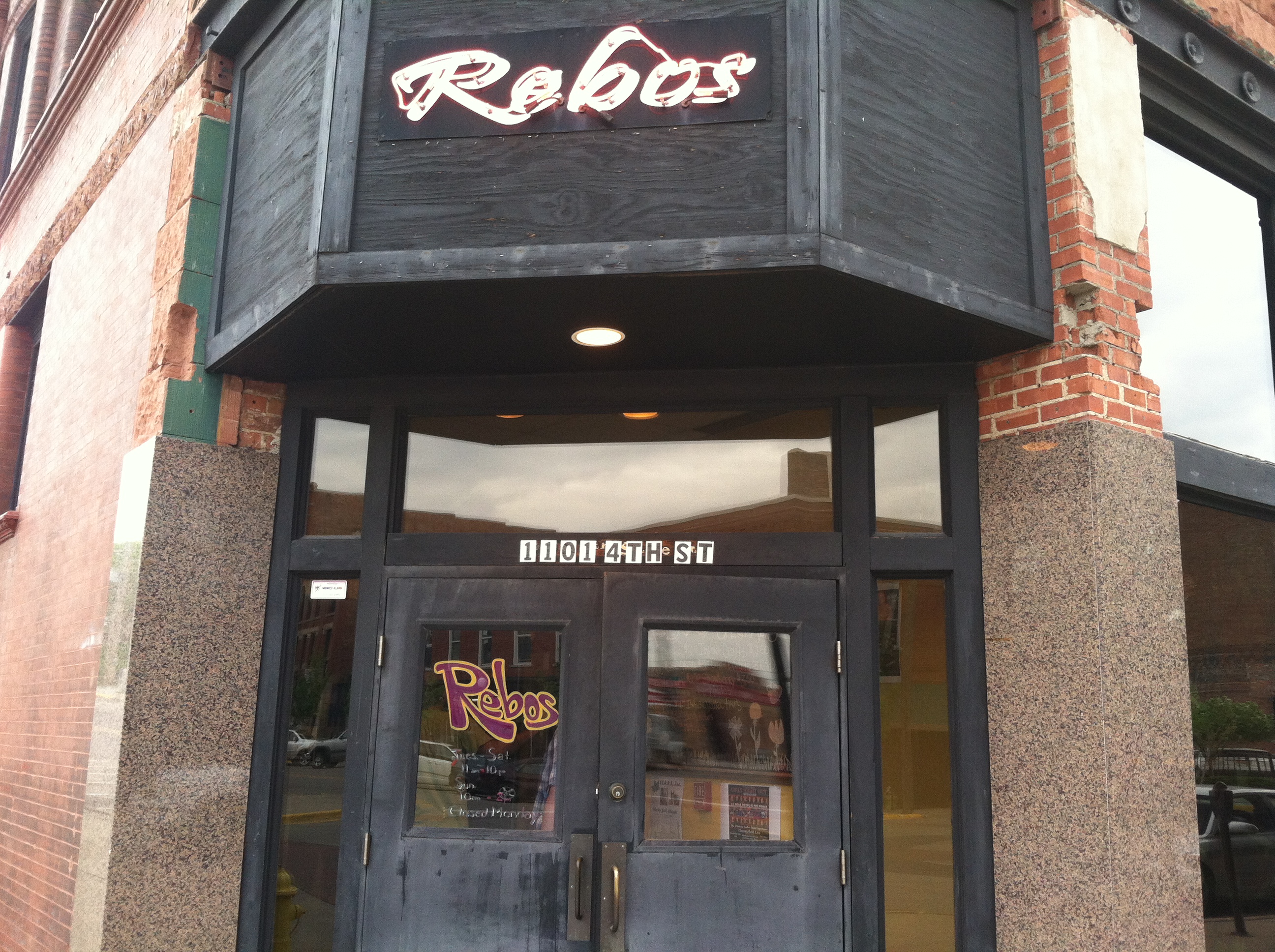
Signage above the door at Rebos
Like some of the restaurants we have, and will, attend for our Eating Siouxland class, I had heard of Rebos but not actually been there. When I was being described to what exactly they were, this is when a red flag went up in my designer part of my brain. There didn’t seem to be a consistent way to describe the restaurant and what they serve. I heard they served Mexican food, Caribbean food, Tex-Mex, or even a mix of Tex-Mex and Caribbean. Now, I realize that this doesn’t sound all that confusing, but there is a big difference between just a Mexican or Tex-Mex restaurant and a Caribbean restaurant, particularly in a town like Sioux City. There are several Tex-Mex restaurants around, not just in Sioux City, but all over the place, but it’s not everyday that you eat a Caribbean themed restaurant, particularly in Iowa.

Interior shot at Rebos
With that in mind, I quickly browsed the web and found more of the same: a lack of consistency in how to describe Rebos. I thought that surely their website would have a nice description of the restaurant, but it didn’t really tell me anything beneficial. They didn’t appear to have a logo or branding on this website, nor any information that was worthwhile other than a menu, which as it turns out, is no longer up to date. It wasn’t until I got to their Facebook page that I saw a description that helped describe their food. They wrote “family owned unique restaurant offering flavors from the Caribbean, Jamaica, and Mexico. Aromas of a wood fire grill, sights of local artist and sounds of the time surround you.” Not a bad explanation, but it really should not have taken me, or anyone else that long to find a decent description from the restaurant itself. Plus, I spent the time searching because I was already going there, put me in the shoes of someone who has choices and they couldn’t find much a description anywhere, and they will lose interest quickly.
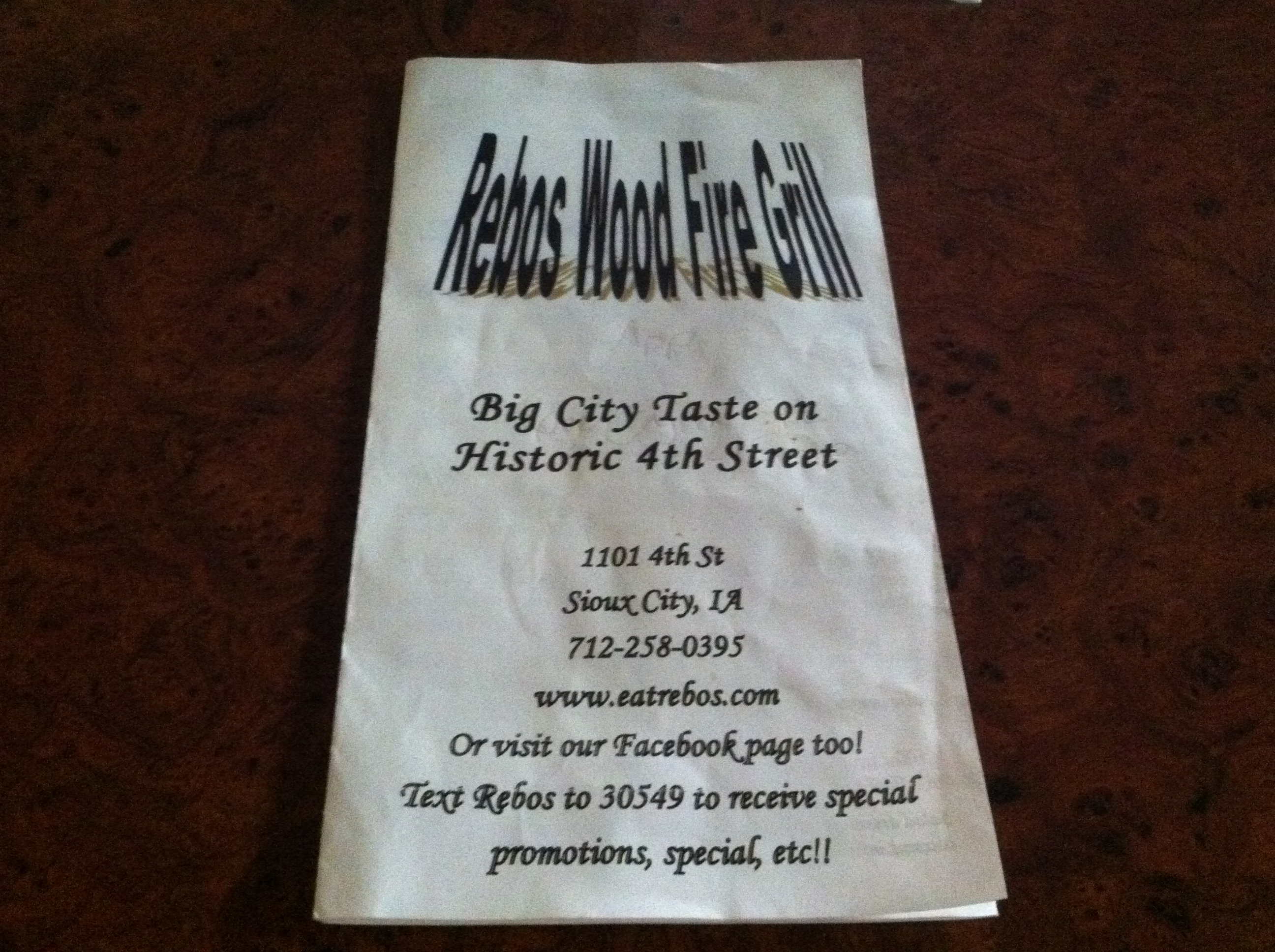
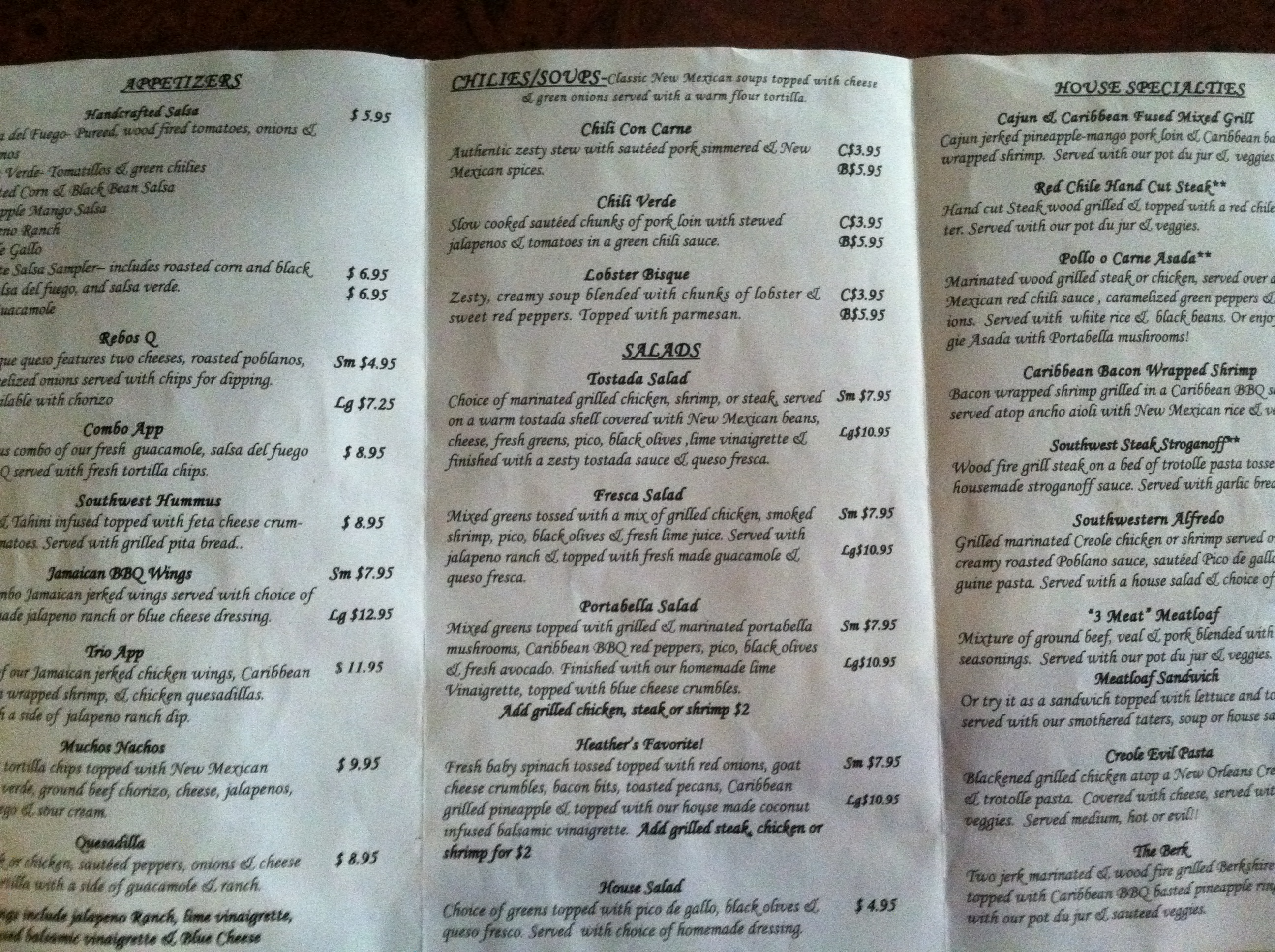 Arriving at the restaurant was the first time I had seen what is Rebos logo. Outside the door, the only identifier they had was a neon sign that said “Rebos”. Inside I saw the first logo that described the restaurant. They took the same script font and added “New MexiCaribbean” and “Woodfire Grill” under it. Finally, a logo that described the restaurant. But there isn’t much of a reason for it to be inside the restaurant. A logo is supposed to communicate to those who don’t know you, so why is the first time I saw a logo that communicated what they were was when I was inside the restaurant itself? Also noticeable, and adding to the idea of a lack of consistent branding, was that this logo was the only one that I saw where the name had an apostrophe, appearing as Rebos’. The logo itself really wasn’t all that bad, but in the end, it’s how you use the logo that really matters. The dining area was decorated okay, painted with bright “Caribbean” colors. One wall had paintings of fish and ocean, which added nicely to the style of the restaurant, but the back wall was painted with deer all over it, which didn’t make much sense in the environment. After being seated, we were handed the menus, which I had mentioned, were not the same menus as the ones on the website. These were also underwhelming on the design side, clearly having been made with Microsoft Word’s WordArt for the logo, which in the end looked nothing like the rest of their branding. Again, here they used a different tagline that I had not seen before, “Big City Taste on Historic 4th Street.” All of the text was typed up using the same script font, leading to readability issues for the paragraphs of text. It wasn’t the easiest menu to navigate either, I think mostly because of the use of the same script font throughout.

Caribbean Bacon Wrapped Shrimp
All the other aspects of the dining experience were very exceptional. The service was friendly, helpful, and knowledgeable, helping some of our group through detailed descriptions of foods. After struggling to decide what to order as there were so many different ones I would have liked to try, I settled on the Caribbean Bacon Wrapped Shrimp. It was described as this: “Bacon wrapped shrimp grilled in a Caribbean BBQ sauce & served atop ancho aioli with New Mexican rice & veggies.” After trying several different appetizers my table had ordered, I was impressed and convinced that this shrimp was going to be very tasty. It did not fail to meet my expectations. It was easily some of the most unique and delicious food I’ve had in Sioux City. The Caribbean BBQ sauce had a spicy kick to it, but it wasn’t so much that it overpowered the flavor. The combination of all the flavors of the shrimp, bacon, and BBQ sauce mixed together to form a delicious meal. The Mexican rice and vegetables were a perfect side for the dish. I’m usually not a fan of zucchini and some of the other vegetables on the plate, but I ate all of it simply because they were flavorful and went so well with the other food.
Rebos has excellent food and service. I would definitely like to go back and try some of the other items on the menu. I would, however, need to plan ahead as parking could be difficult downtown in their location, and the place fills up quickly so the wait could be a while. And no matter how good the food was, I will always be a little disappointed in their branding effort. For such a unique experience in Sioux City, I expected more on that side and hopefully someday they will try to improve that area to ensure they have a good, and long, future.
[…] http://wordpress.morningside.edu/eatingoutwithadesigner/rebos-and-an-identity-crisis/ […]