Some of the previous restaurants we had attended during this May Term class had artwork done by local artists, but none of them displayed as much artwork as the Indigo Palette does. That’s really to be expected from a place that considers themselves an art gallery first, though. I was excited for the Indigo Palette, but not necessarily for the food. Like some of the other restaurants in this May term class, I had heard of the Indigo Palette, but had not been there. As an art student, I was planning on going there eventually, but this class arrived before I got the chance to go on my own. It’s safe to say I was more excited to see the place and the artwork than to actually eat there.

Indigo Palette Sign
Arriving at the Indigo Palette, I first stopped to check out their sign and the logo. I was a underwhelmed by their sign and really wished they had done more. The wood texture on a tin sign looked kind of cheesy, and there was simply too much going behind the words. The drop shadow was way too far away from the words, and the painting palette and paintbrush was hard to distinguish. The images of the alcoholic beverages and the fork and spoon around the palette are an unnecessary touch, as well. I also disliked the tagline in black with a white stroke around it. I don’t think it needs to be on that sign first of all, but the white stroke around the text causes a lot of readability issues. The logo had several readability issues against that wood texture on the sign, but it didn’t look good anywhere else they used it either. All this sounds pretty harsh, but to be honest, I expected more from a place that focuses on art. They have such a cool look and idea, I hate to see them use a poor logo on top of it all.
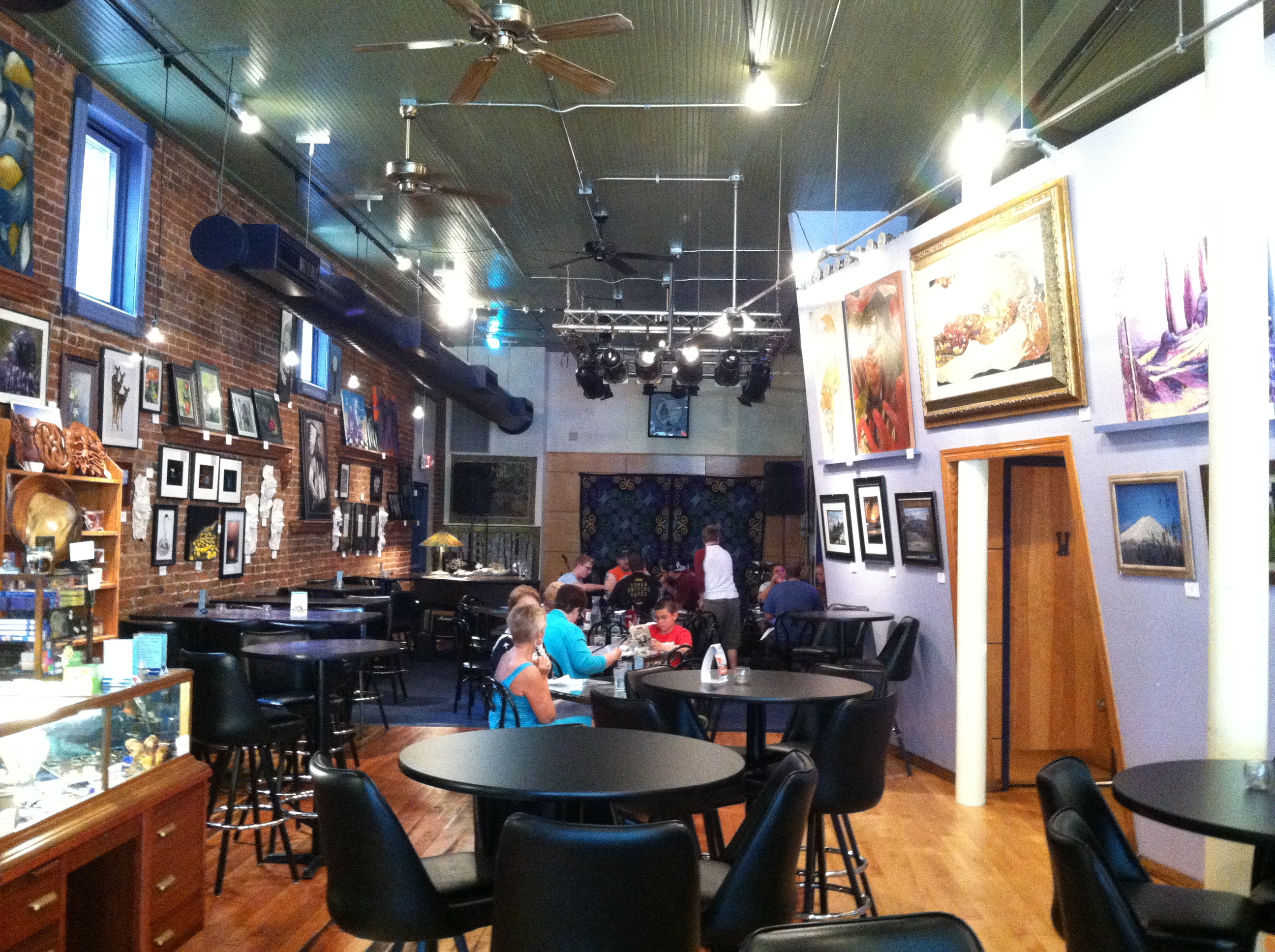
Interior of Indigo Palette
The inside of the restaurant had a great look and feel. The browns, blacks and indigo blue color scheme had a very artistic feel and went well with the environment. The walls were covered with various paintings, pictures, and artwork all of which were for sale. Right inside the entrance, there was a counter featuring jewelry and other smaller artwork for sale. On the other side, they had their bar. Tables spanned the entire length of the restaurant, with a stage for live music in the back. Again, the place just had an awesome look and is well worth going to just to check out the building and the artwork on display.
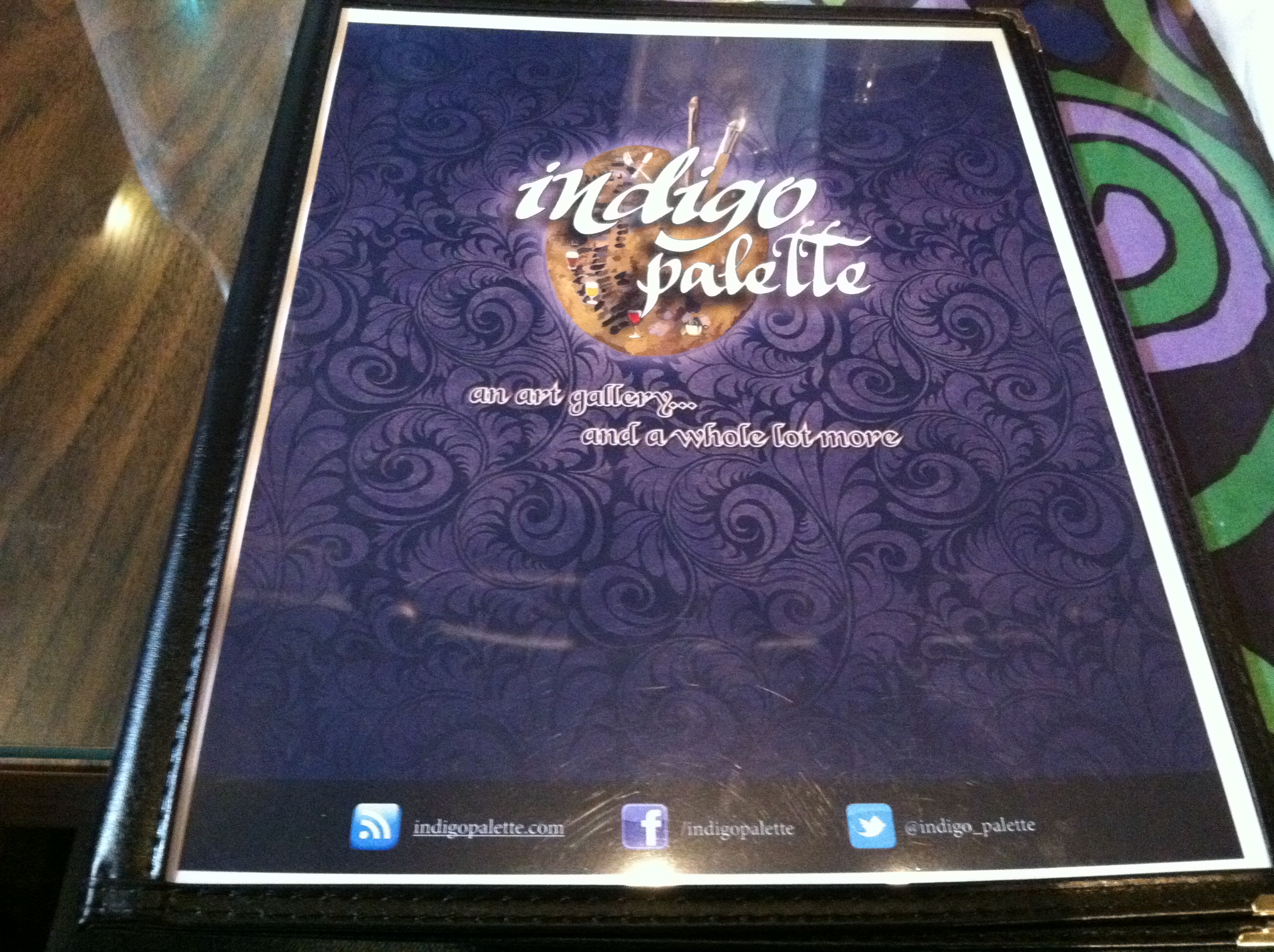
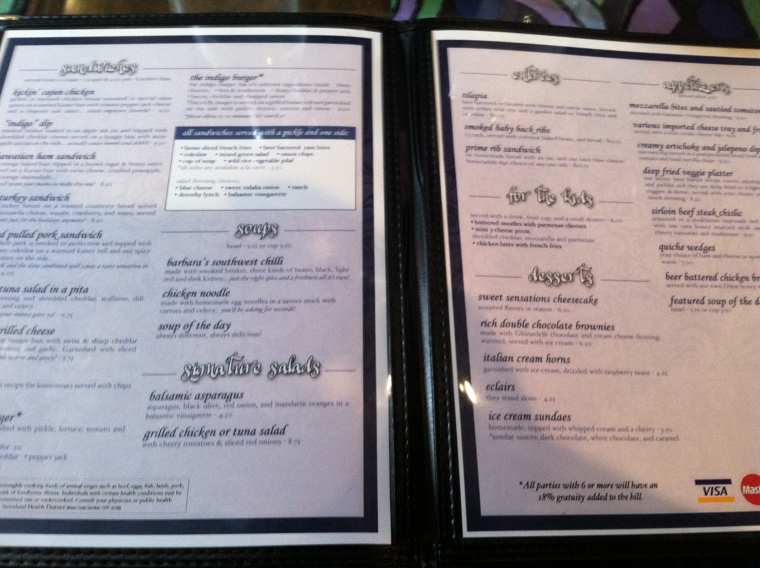
Moving onto the dining experience, the menus had a decent look. The cover was ok, except for the logo, and the typography used on the inside was ok. It could have done without the drop shadow under the headers and the font size was a little too large for my taste, but everything was still readable and you could easily navigate the menu.
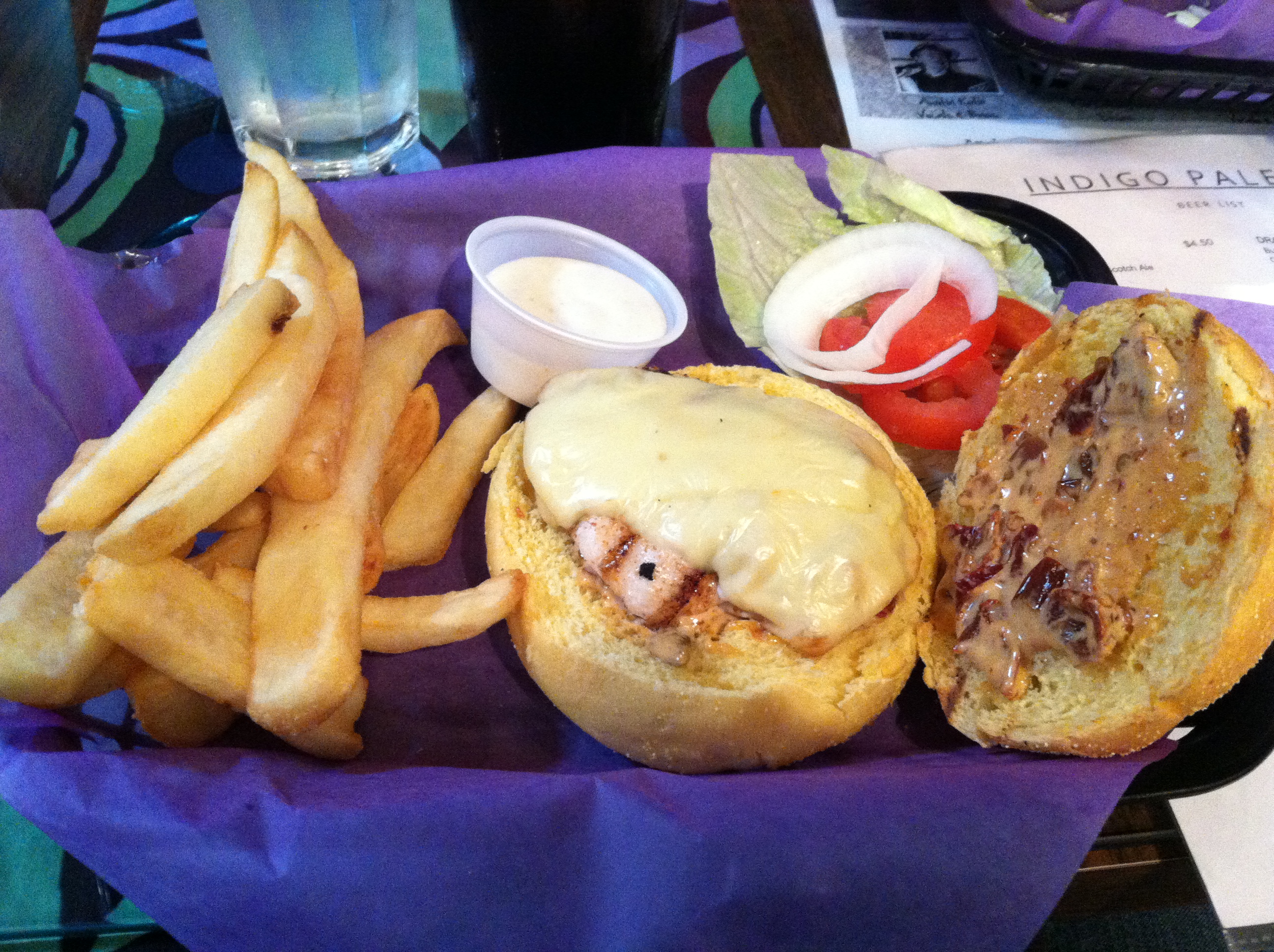
Kickin’ Cajun Chicken
I ordered Kickin’ Cajun Chicken sandwich with a side of fries. The food actually exceeded my expectations. I didn’t expect the sandwich to be quite that good. The grilled chicken was moist and tender and tasty. The chipotle aioli sauce and pepper jack cheese added that nice kick to the sandwich. It wasn’t overly spicy, but you could definitely tell it was “Kickin’.” The fries were a nice side, as well.
In the end, I will definitely be going back to the Indigo Palette, but next time it will be equally for the artwork and the food. I hope the do something with their logo, but I hope they still keep their overall look and feel of the restaurant.
Comments