Our second upscale dining for our May Term class was at another very popular Sioux City restaurant, Minervas. Having heard good things about this one, I was very hopeful for a great experience. Little did I know that this would be my most favorite restaurant we would go to during this class.
Before we left for Minervas, I took a peak at their website. Simply said, I was blown away. They had a great website for a restaurant, particularly one in Iowa. I had looked at the other restaurant’s websites, and all the ones that actually had a site could use some (or a lot of) work in my opinion. Minervas, though, was superb. It was cleanly designed, easy to navigate, had high quality images, and was very helpful for finding information. I could easily keep going on about their website, and about how it compared to the other restaurant’s, but this would turn into a book before I knew what happened. That said, I will mention this. In today’s society where everything and everyone is online, there is no excuse for a bad website, even more so for a restaurant. If you’re looking for something new or unfamiliar with dining options in a city, where are you going to look for answers? Online. And what happens if you come across a restaurant with a terrible website that doesn’t tell you anything about them or show you their menu? You’re probably not going there. A bad website is just as bad of a reflection as having no website, and a good website is only going to make you look much better to a potential customer.
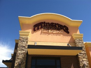
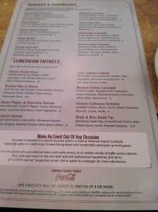
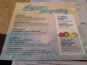
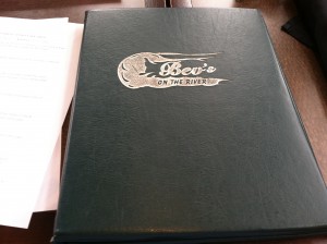
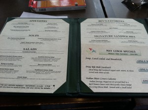
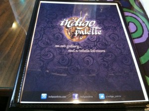
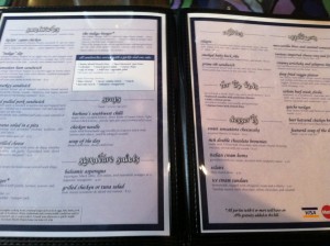
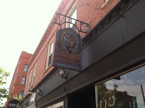
The website on it’s own excited me, so I was very hopeful that they took good design into consideration for the rest of their things. Their logo is nice and professional looking. I don’t have any major complaints about it except that I’m not a huge fan of how the ‘r’ and the ‘v’ overlap. All in all, it’s readable, unique, and can stand alone, all things that a logo needs to do. Looking at their menu, I was just as impressed as with the rest of the design work. Although this was the lunch menu, they still put quality time into designing it and it paid off. It was easy to navigate and read, and was interesting to look at on top of it all. They even had a “Summer Selections” menu that was well designed. You can tell that this was professionally done and adds to the class and quality of the restaurant itself.
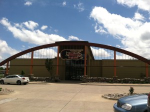
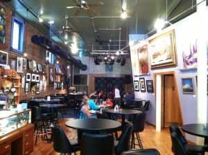
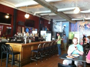
The interior appearance of the restaurant was great too. It had plenty of seating and room, with a good variety of tables and booths. It was very clean and well kept, again adding to the classiness of the restaurant. The staff was all very friendly and knowledgeable, as well. The dining experience for these things was excellent.
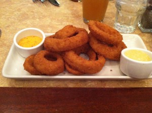
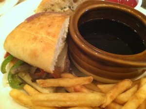
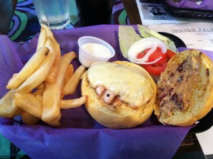
For an appetizer, I ordered the crunchy onion rings. They came with two different sauces, horseradish Dijon sauce and red pepper aioli. Both were very delicious and enhanced the favor of the onion rings tremendously. Personally, I really enjoyed the Dijon sauce, as it had a lot of flavor and was really a unique taste. For my main dish, I ordered the Chicago Style Dip with fries. The dip was served on an artisan roll, with provolone, onions, and peppers. It came with au jus. Everything for this was delicious and seasoned well. It was a very flavorful sandwich and the fries were equally as good.
All in all, I would say Minerva’s was my favorite restaurant of them all. Everything that I looked for in my blogs was answered at this one restaurant. They cared about the design side of owning a restaurant as much as they cared about the quality of service and food. Anyone in Sioux City that’s interested in design needs to go to this restaurant to enjoy it as much as I did.

Comments