From the “burr under the saddle” dept.
Formatting and the Sioux City Journal’s website.
One of the things that irks me about the Journal’s online site is some of the weird formating. Some aspects of the formatting, which I am pretty sure is automatic, appears to either be out of the control of the staff, or the posting of some stories is completely automatic and nobody ever looks at what is posted.
If you click on many stories on the “Recent Local News” pane, the article which comes up will have a double headline:
Now, if these posts have no human intervention, then I suppose it is plausible that this an automatic thing.
Still, doesn’t anyone ever check what gets posted by the robots? Ideally, robots in the newsroom might seem pretty handy – perhaps they could do some of the drudge work, like, well, scanning the tri-state wires for items that tick enough keyword boxes to automatically be amended to the online version of the paper.
(Insert awkward silence here . . . )
OK. Well then, has anyone of the programmers ever looked at what the automatic formatting is doing? Aside from misspellings of common words, I tend to think that this type of error is pretty glaring. I don’t think (at least I hope) that this goes through human hands on the way to the web.
As I worked my way up through production in TV, eventually to be the 6 & 10 weeknight director, one thing above many was hammered into me.
FORMAT FORMAT FORMAT!
From graphics to music, to the structure of the show to the logos on the news vehicles, there was one way to do it. Everyone knew the format (or was supposed to) and that way, the thought was that no matter who was working the show would always look the same.
I don’t want to nitpick, but this formatting error has been pretty constant for a while now. I cannot say for sure, but it might have existed for at least as long as this current on-line format of the Journal has been around.
Well, I’ll get off of the soapbox now. At least this is probably not as annoying to me as the ads that show up and move the content down the home page. That’s probably a rant for another week.
Chris
From the “who approved this??” dept.
A recent article posted on the Sioux City Journal’s web site (lifted from the Des Moines Register) covers the uproar caused by Drake University’s latest marketing idea.
http://www.siouxcityjournal.com/news/weird-news/article_dd1863bc-77a8-5a7e-bf2f-a63af7cf6f7f.html
Here it is: (Credit: The Des Moines Register)
Having worked in the industry for the last quarter century plus, I can appreciate a catchy jingle or risque billboard or print ad, especially when well done.
However, the ‘D+’ thing with a school smacks too much like those mild ‘double entendre’ tag lines that make us just a little uncomfortable. Why not go ahead and say ‘Come to Drake and be mediocre!’, or perhaps less!
It did have the result of raising awareness and generating discussion, but not in the same vein as academic excellence and scholastic achievement. As was posted in the title to this article, there has to be some board or at least a department head that should have some explaining to do. If not at the school then at the advertising agency that shoveled this out the door.
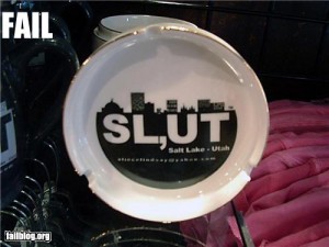
Perhaps the company had something to do with Salt Lake City’s marketing:

According to the Des Moines Register, Drake has pulled the logo from their web site but is still using it on printed matter. No wonder since they probably had thousands of pieces printed up to get a good rate at the printer!
Till next time . . .
Chris


